01 Fintech / Mobile wallet 2021
UOBAM Robo-Invest on Singtel Dash
Making investing part of an everyday wallet.
Singtel Dash, a Singapore mobile wallet, partnered with UOB Asset Management (UOBAM) to offer robo-advisory investing. The hard part was fitting a regulated sign-up, with eligibility, identity and tax checks, into a wallet people used for everyday payments. We built one journey from the first risk question to the first deposit, with every exception mapped before the screens were drawn.
Discovery
Mapping the constraints first.
Singtel Dash partnered with UOBAM to offer investing within the wallet. We adapted UOBAM’s existing product for Dash users.
The team was briefed by Dash’s product manager and the UOBAM team. I mapped the required checks, branches and exception states to surface all the constraints, so the team could review where an application could continue or had to stop.
We had no product-specific user research to work from, so my experience designing for Dash users helped me frame a working assumption: familiarity with a mobile wallet would not necessarily mean confidence with investing. I tried to prioritise Dash’s core users: people who might need help interpreting risk, returns and the movement of their money, but that assumption still needed testing with actual users.
Two gates needed explicit branches: US-person status determined whether an application could continue; Singpass MyInfo or manual registration determined how identity details were collected. Both know your customer (KYC) routes checked the ID against the Dash account before moving on to employment, source of funds, Common Reporting Standard (CRS) tax residency and the declaration. These checks were part of the onboarding requirements supplied to the team. Making those branches visible helped explain the journey to stakeholders and gave the team a defined outcome for each route.
01 / Eligibility
Who can continue?
US-person status is a gate. An ineligible applicant does not enter the next stage.
Before you start
Read the disclosures
Product information, risks and consent.
Eligibility
US-person status
Check eligibility
Establish eligibility and current US-person status.
Currently a US person?
Yes: not eligible, end the flow. No: continue to risk assessment.Yes / End flow
Not eligible
Show the eligibility explanation. The application stops here.
Risk questionnaire
Continue to risk assessment
Assess risk, then confirm a portfolio before KYC.
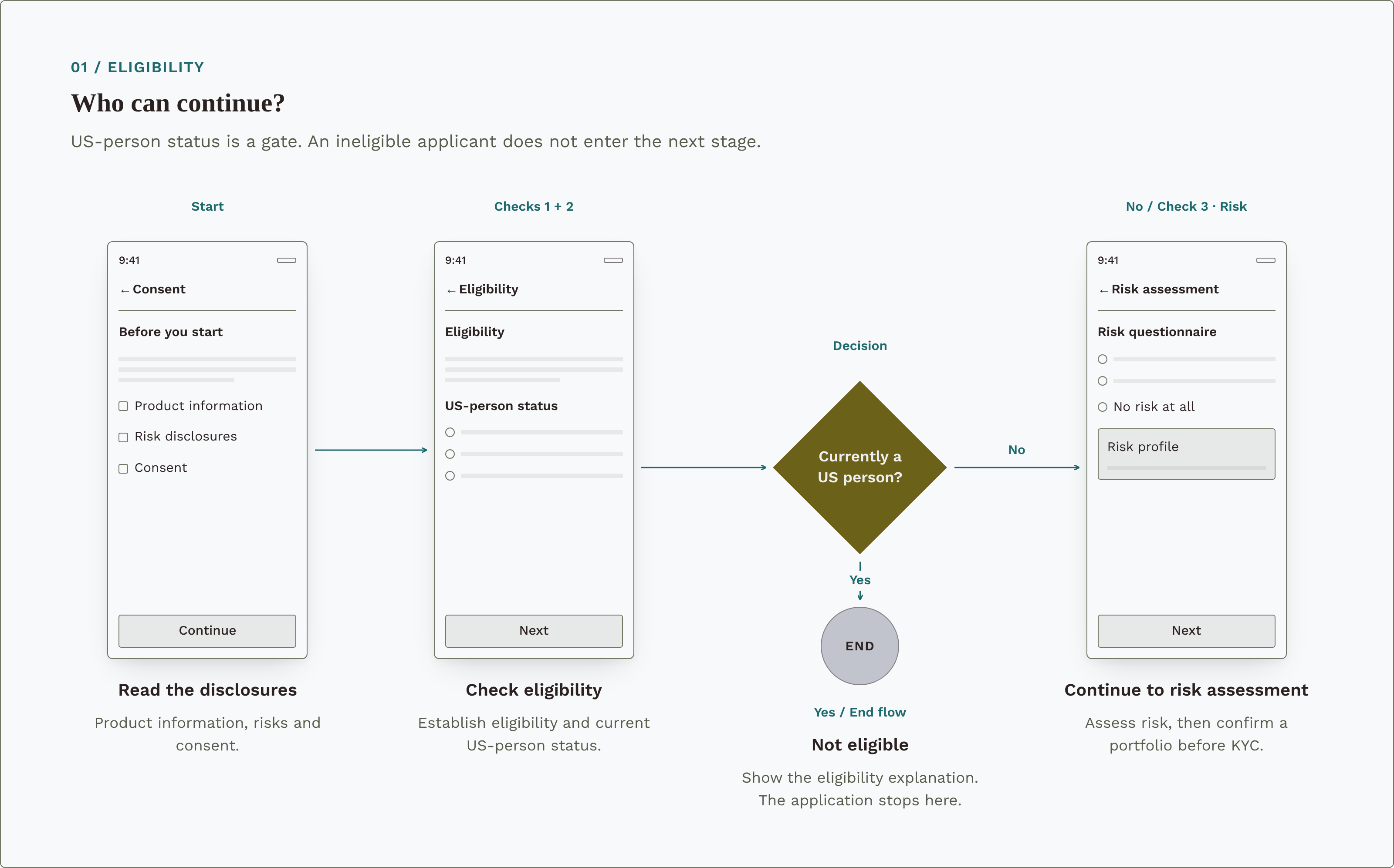
Diagram preview
02 / Know your customer
Two ways to provide identity details.
MyInfo and manual registration converge on the same ID check before the remaining application details.
Use Singpass MyInfo?
Yes: review prefilled MyInfo details. No: register manually.Prefilled from MyInfo
Review prefilled details
Bring in the identity information already held in MyInfo.
Complete missing information
Keep the prefilled details, then add what is missing. Editing a prefilled detail shows a warning before switching to manual registration.
Identity documents
Enter identity details
Choose manual registration directly, or switch after the editing warning.
Review the form and documents
Complete the identity fields and required documents before continuing.
ID matches the Dash account?
Yes: continue to additional information and CRS. No: show a blocking mismatch alert and review the identity details.No / Progress blocked
Resolve the ID mismatch
Explain the mismatch. Dismissing the alert returns to the identity details; it does not submit the application.
Complete the remaining details
Employment, source of funds and CRS tax residency.
Review and declare
Declare and submit
Review the declaration and give consent to submit.
Application submitted
Verification follows
Submission begins verification; it does not mean the account is approved.
- Unchanged MyInfo
- Pending review
- Manual / edited MyInfo
- Pending video call
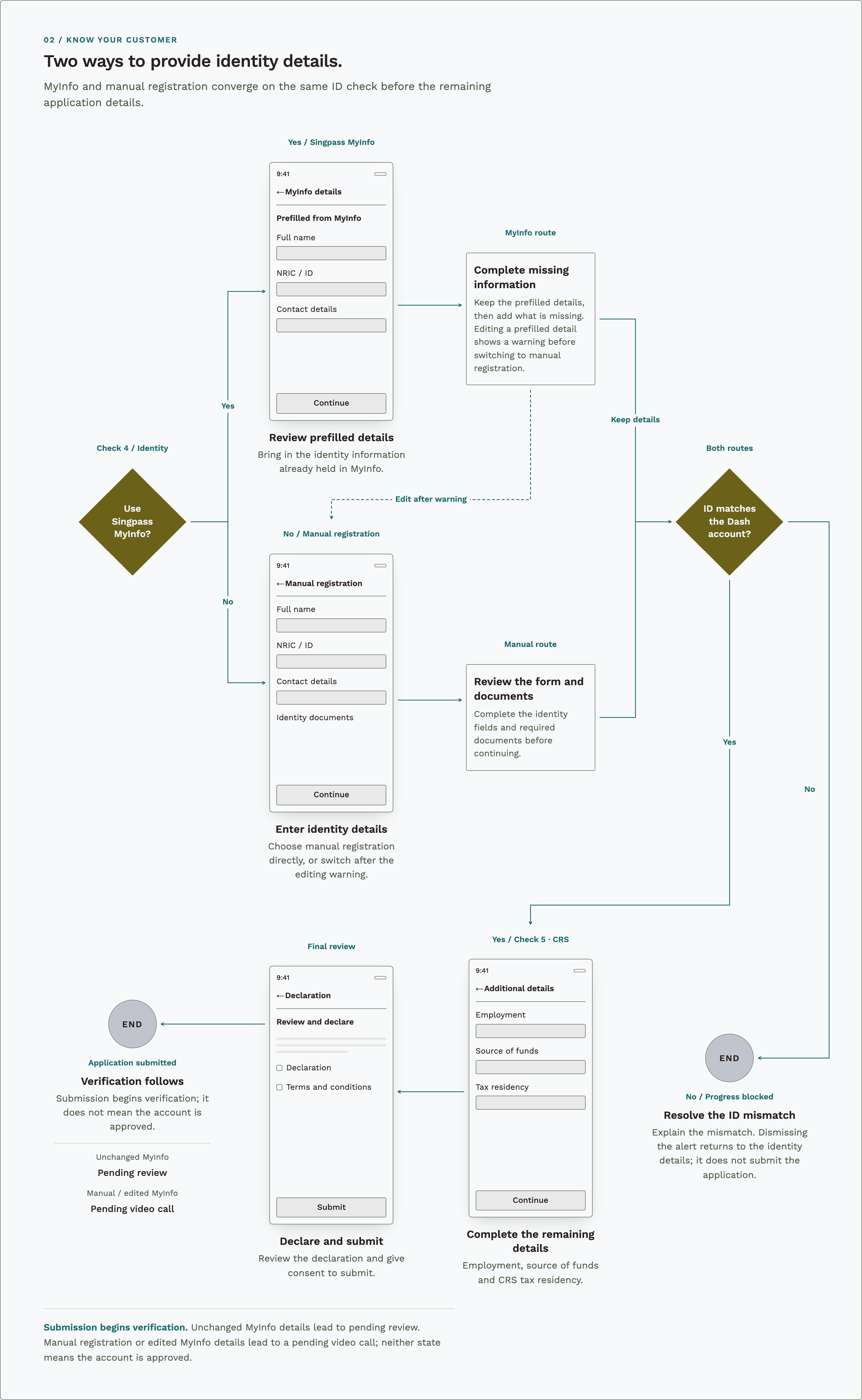
Diagram preview
Design
Where the money is, and what to do next.
Decision 1
Ask about risk first.
UOBAM’s original onboarding started with planning: an introduction to the Portfolio Planner, a goal, a time frame and contributions. The first risk question was much later, at screen #12. Someone who went through the effort of Singpass MyInfo and the KYC flow could end up not being able to invest if they chose “I do not want to take any risks”.
This would be a terrible experience, so I moved the risk assessment to the start of onboarding, straight after the eligibility check, and made the first question a gate so nobody would have to hand over personal details unnecessarily.
During internal testing, I proposed moving that answer to the top of the list. I recall UOBAM keeping it last to let clients continue, so the answers that led to investing came first. The way out was there, but less prominent. I’d test the wording and the order with people new to investing.
Before / The original order
Risk came after the plan.
Goals and contributions came first. The first risk question was screen 12, and choosing no risk only ended the application after KYC.
Three steps to your portfolio
Three steps
Goals and contributions, then risk and portfolio, then personal details.
Your goals
Meet the planner
Six introduction slides, then the Portfolio Planner.
Choose how you want to invest
Choose a goal
Build my wealth, retirement, a house or education, and how long for.
How long are you saving for?
Set contributions
A single contribution, a regular one or both.
Risk questionnaire
Assess risk
Every answer continues, including no risk at all.
Your plan
Plan the portfolio
Adjust goals, risk and contributions in the planner.
Complete KYC
MyInfo or manual registration, the ID check, employment, source of funds, CRS and the declaration.
Chose no risk / End flow
Not eligible
Only now is someone who wanted no risk told they can’t invest.
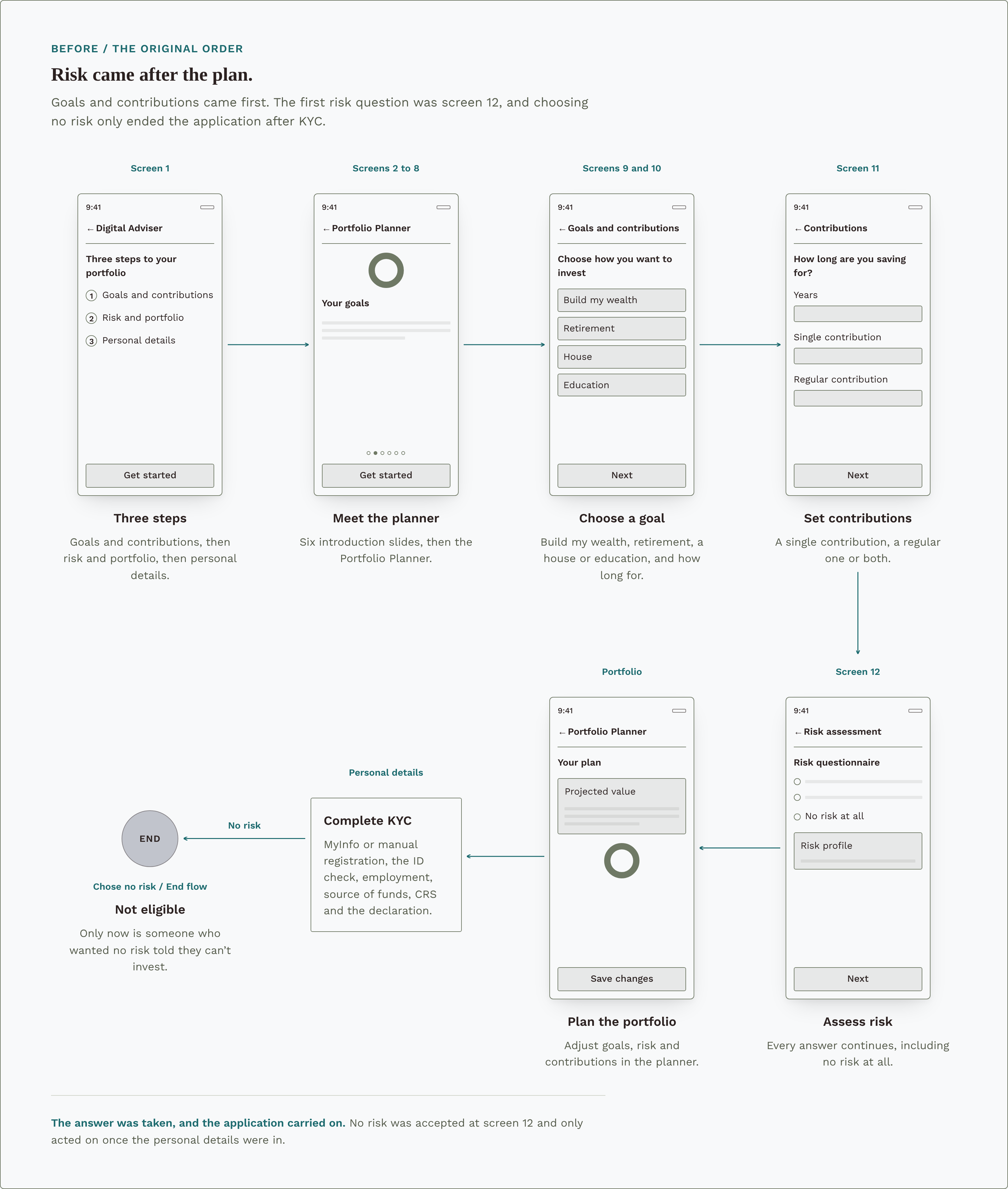
Diagram preview
After / Risk first
Risk comes first.
After the disclosures and eligibility check, onboarding opens on the risk questions. Choosing no risk is explained at the first one.
Your objectives
State your objectives
Nothing is pre-selected. The last answer is no risk at all.
Chose no risk?
Yes: explain why and point to UOBAM. No: continue to the second question.If your portfolio fell
React to a fall
What you would do if the portfolio lost value.
Retake
See your profile
Next to continue, or Retake to start the questions again.
Find out why
Every investment carries risk. Contact UOBAM, or Okay to go back.
Invest sustainably?
Choose ESG or not
Whether to consider sustainable funds.
Your recommendation
Change portfolio
Confirm a portfolio
One recommendation, with Change Portfolio close by.
Complete KYC
MyInfo or manual registration, as mapped in Discovery.
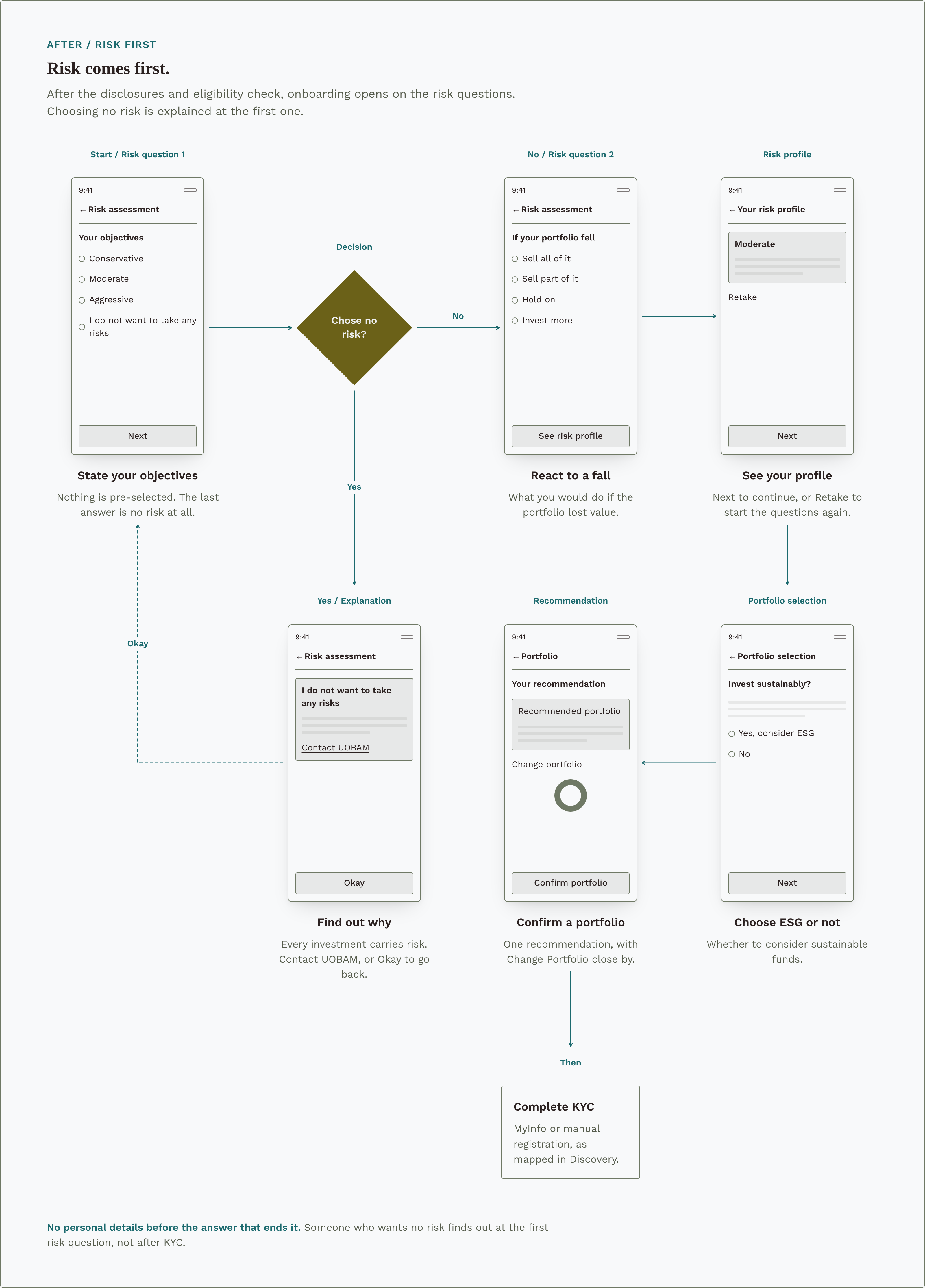
Diagram preview
Decision 2
Show people where their money is.
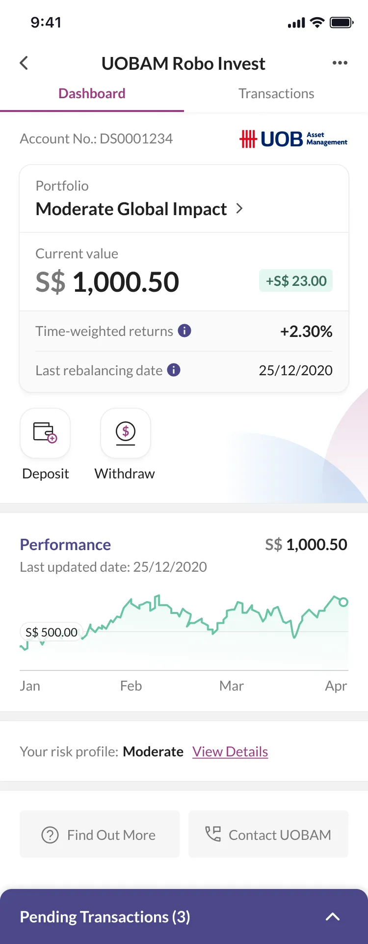
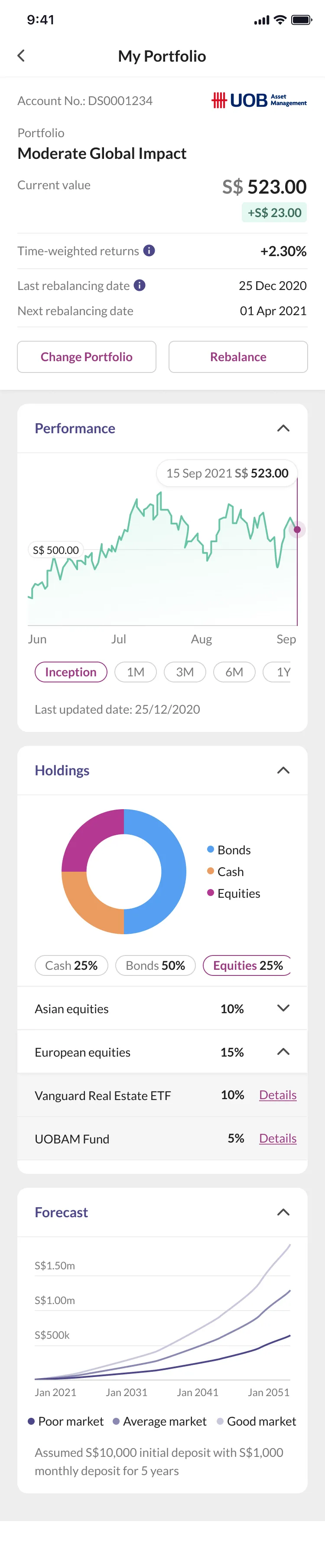
The portfolio needed to support a quick balance check as well as a closer look at the investment. I put current value, returns and the main actions first, with performance, holdings and forecasts in separate sections below. That kept the first read focused without removing the underlying detail.
The trade-off was a longer page, with some information behind expandable sections. I kept past performance separate from projections and retained the forecast assumptions, but I had not tested whether people understood that distinction.
The same order, from sign-up to withdrawal.
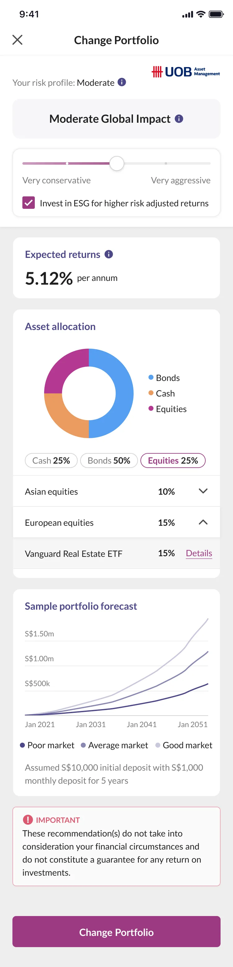
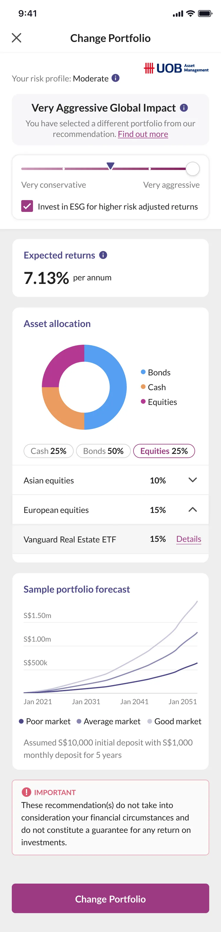
I designed the same hierarchy throughout the user journey. After the risk questions, onboarding offered one recommended portfolio with the option to change it. This limited the initial comparison while adding options if users wanted an alternative. The dashboard was designed with the investment numbers and the main actions that can be taken always visible.
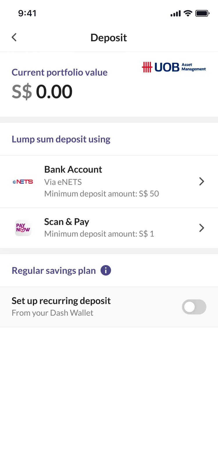
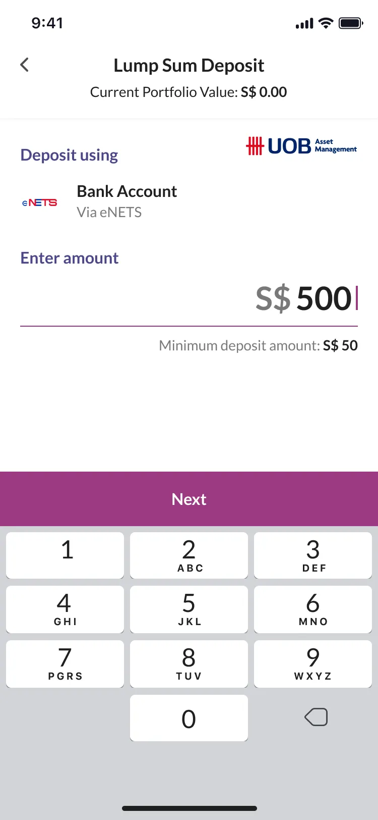
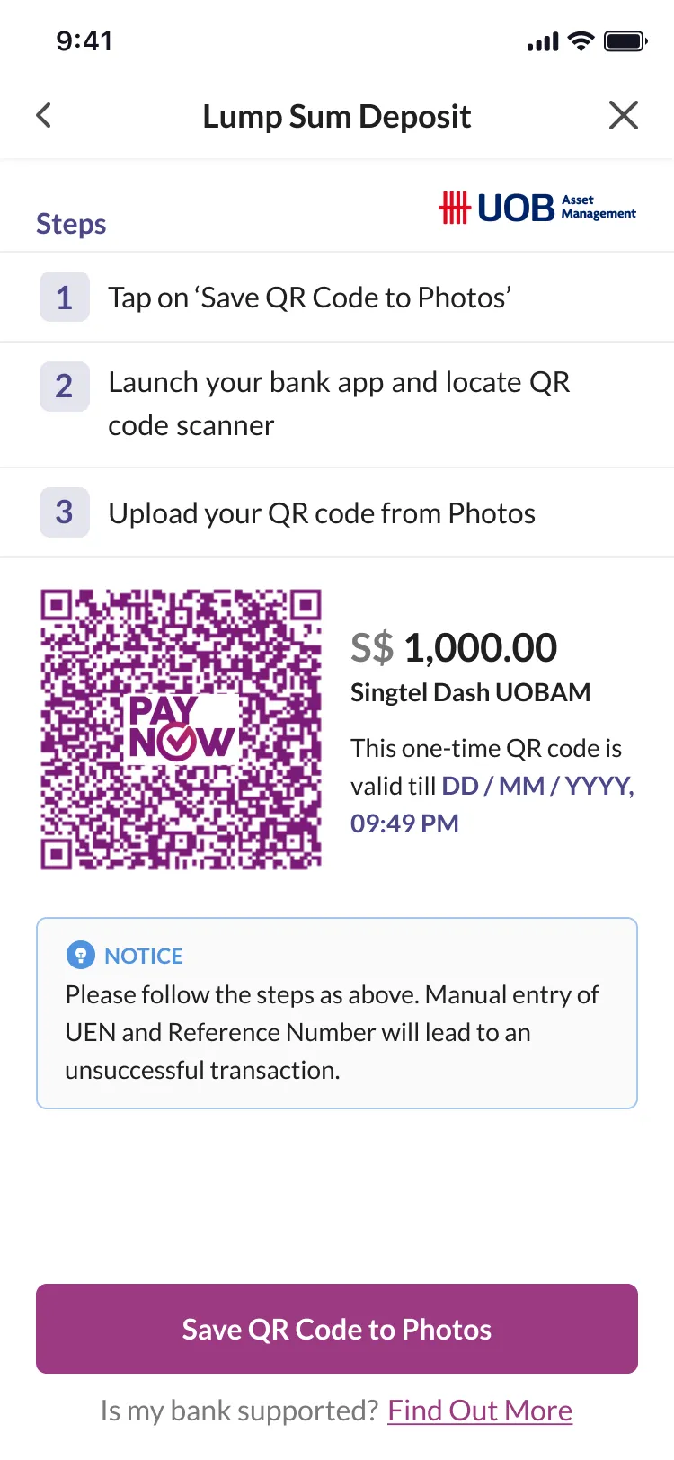
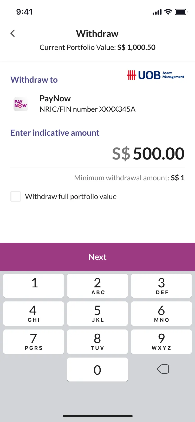
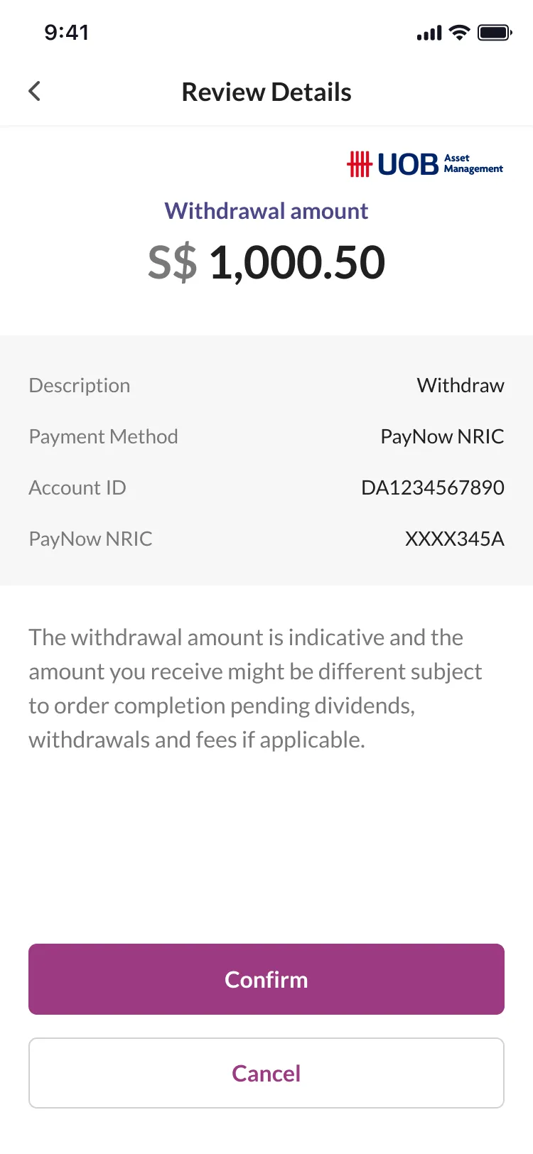
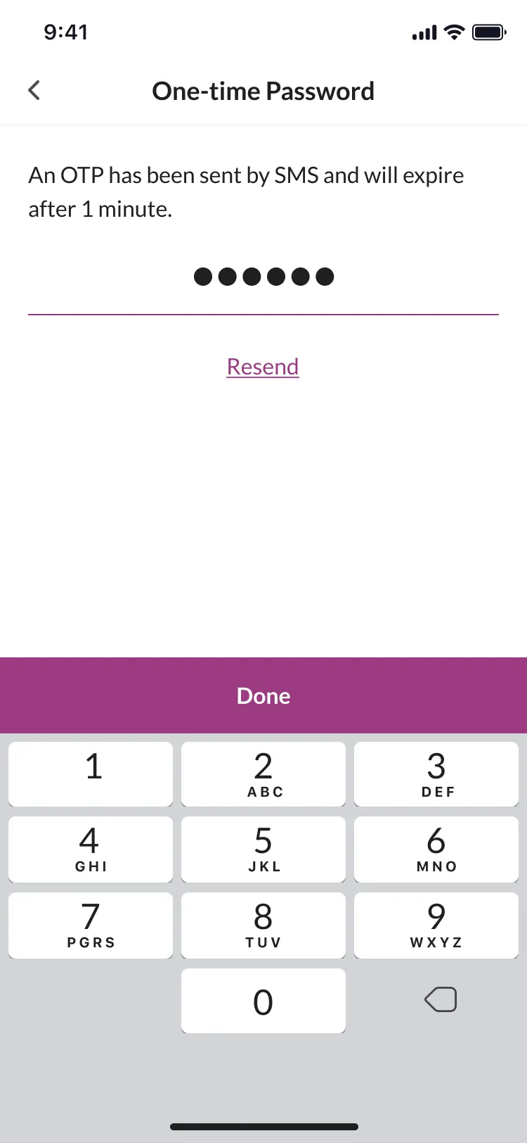
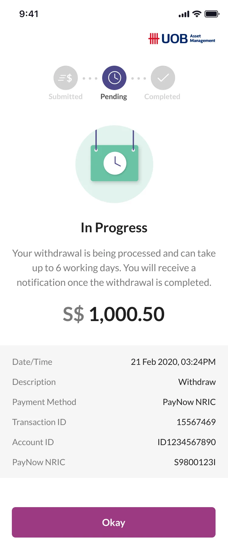
Moving money raised different questions: what the deposit options were and where users would receive their funds after withdrawal. Deposits showed each funding method’s minimum before amount entry. Withdrawals kept the destination visible, labelled the amount as indicative and allowed the user to check the details before confirmation. Those review steps were added deliberately to increase friction, giving users another opportunity to verify their intended action.
Point at a number to enlarge that part of the screen.Tap a number to read its note.
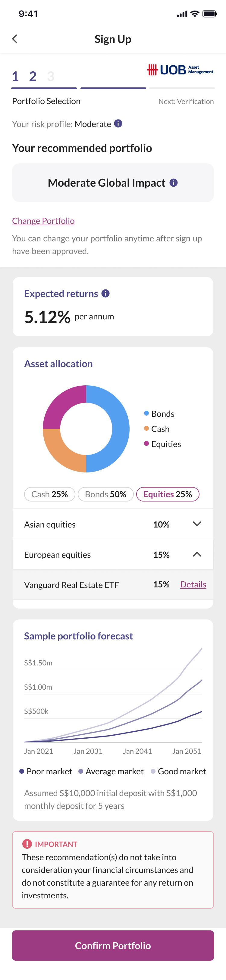
Progress at every step. A stepper shows progress on every onboarding page.
A recommendation with room to change. The risk profile provides a recommendation to start from, with the option to change the portfolio.
Explore the selected funds. Selectable chips let users explore the selected funds in more detail.
Point at a number to enlarge that part of the screen.Tap a number to read its note.
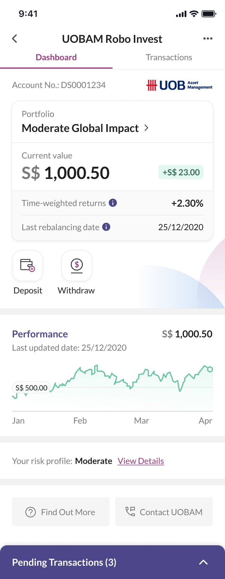
The essentials at a glance. The most relevant portfolio information is available at a glance.
Moving money, together. Deposit and Withdraw stay together so users don’t have to dig through menus.
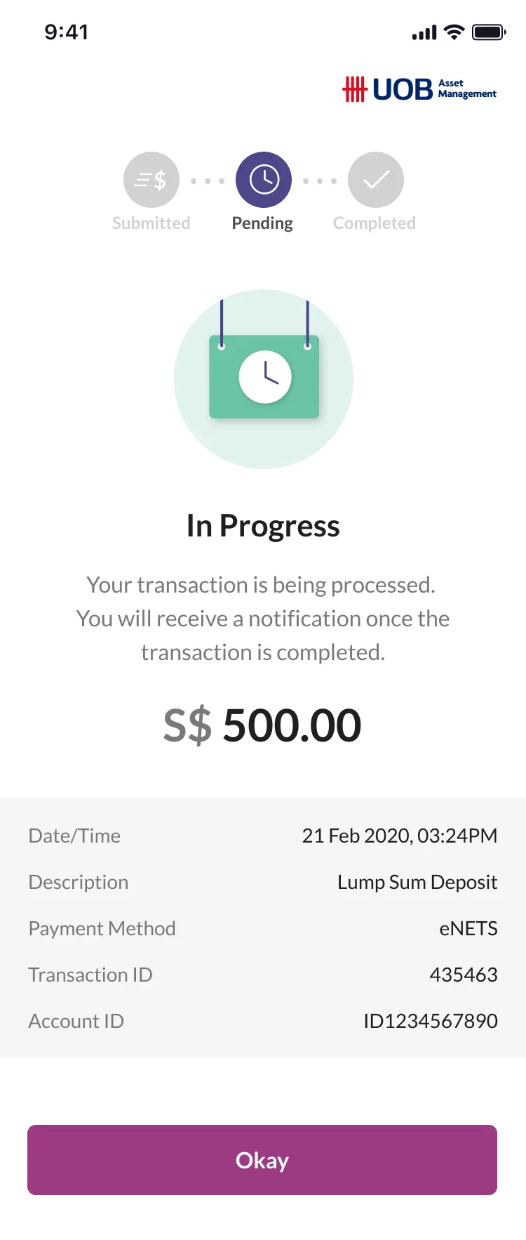
Transaction detail when needed. The pending transaction drawer hides necessary detail that isn’t relevant to the current view.
Point at a number to enlarge that part of the screen.Tap a number to read its note.
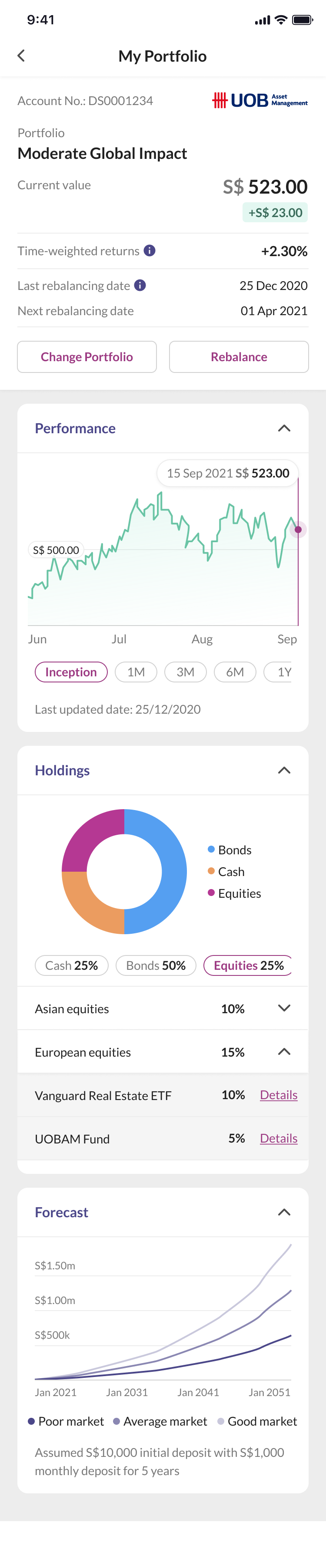
Portfolio actions within reach. Change Portfolio and Rebalance sit beside the summary.
Less information at once. Collapsible sections hide extra information that could overwhelm beginner investors.
Point at a number to enlarge that part of the screen.Tap a number to read its note.
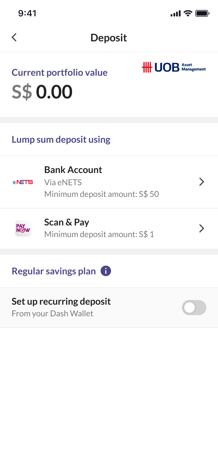
Minimum deposit amounts upfront. Each funding method clearly states its minimum before amount entry.
An ongoing action. A toggle indicates the ongoing nature of recurring deposits.
Point at a number to enlarge that part of the screen.Tap a number to read its note.
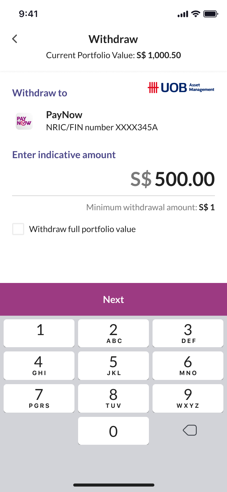
Destination and method visible. Where the money is going and the withdrawal method are always visible.
Withdraw the full amount. Users can select the full portfolio value instead of entering the amount manually.
Build
Handing over the whole journey.
The feature followed a waterfall process, with limited iteration once designs were sent to the offshore engineering team. The handoff covered flows, screen states and interaction rules using Dash’s design system that the team and I co-created. My colleague June Kang owned the UI. My responsibility was making the journey and its behaviour explicit.
Exceptions mattered as much to the experience as the happy path: an identity mismatch blocked progress, editing MyInfo details changed the registration route, and a withdrawal needed a review and pending state. We worked with the UOBAM team for compliance reviews, QA sign-off and dogfooding. Those internal checks supported delivery, but we didn’t have time to test the experience with customers.
Interactive prototype
Explore the dashboard
Tap the portfolio name to explore performance, holdings and forecasts. Or try Deposit and Withdraw from the dashboard.
Dashboard → My Portfolio
Original 2021 screens with sample data. Payments and verification are simulated.
Enable JavaScript to try the prototype. You can scroll the dashboard preview below.
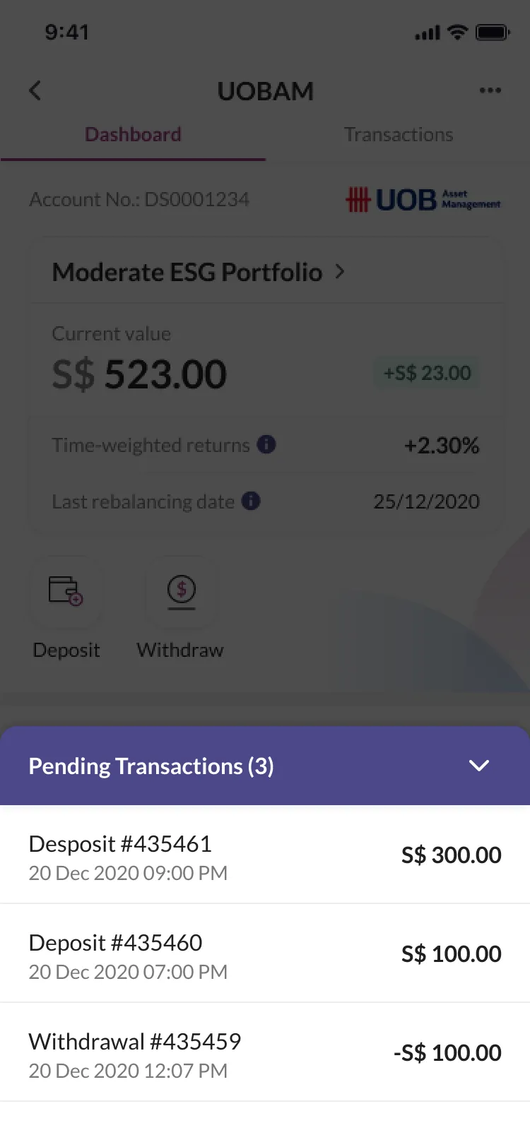
Pending Transactions (3)
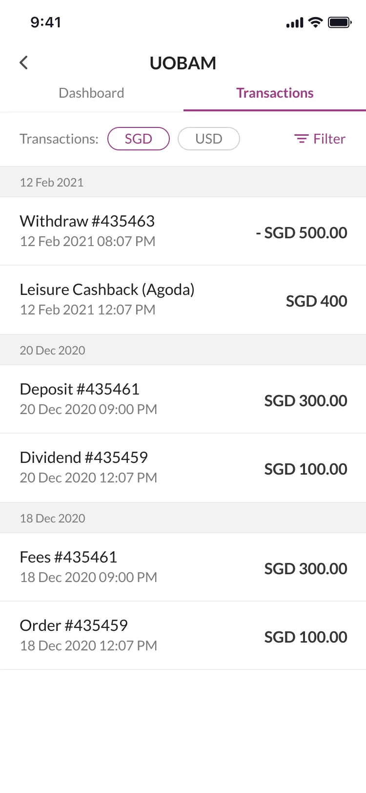
Deposit #435461, 20 Dec 2020 09:00 PM, S$ 300.00. Deposit #435460, 20 Dec 2020 07:00 PM, S$ 100.00. Withdrawal #435459, 20 Dec 2020 12:07 PM, -S$ 100.00.
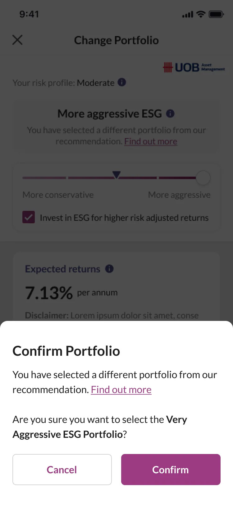
Confirm Portfolio
You have selected a different portfolio from our recommendation. Find out more. Are you sure you want to select the Very Aggressive ESG Portfolio?
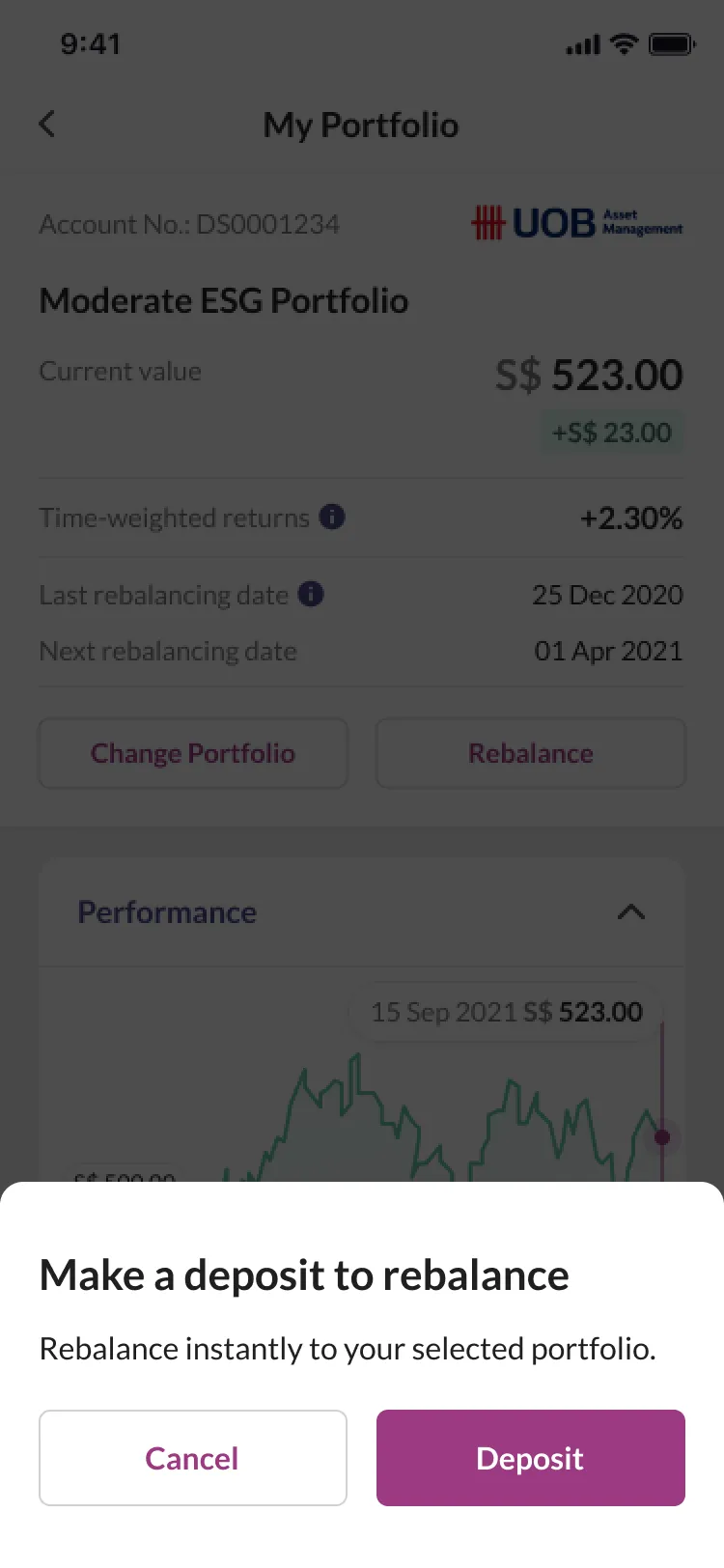
Make a deposit to rebalance
Rebalance instantly to your selected portfolio.
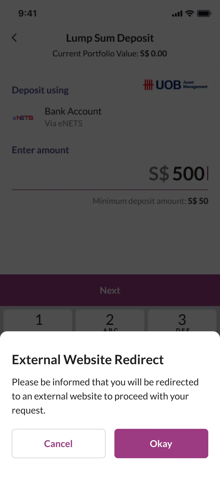
External Website Redirect
Please be informed that you will be redirected to an external website to proceed with your request.
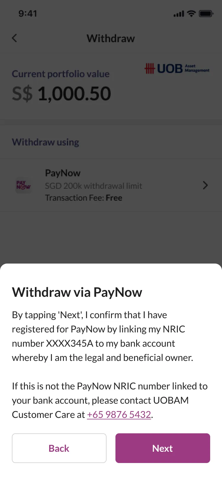
Withdraw via PayNow
By tapping Next, I confirm that I have registered for PayNow by linking my NRIC number XXXX345A to my bank account whereby I am the legal and beneficial owner. If this is not the PayNow NRIC number linked to your bank account, please contact UOB AM Customer Care at +65 9999 9999.
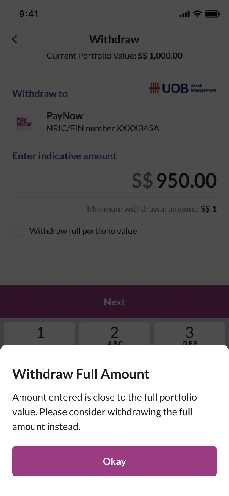
Withdraw Full Amount
Amount entered is close to the full portfolio value. Please consider withdrawing the full amount instead.
Regular savings plan
Set up a recurring deposit from your Dash Wallet. The handoff supports weekly or monthly deposits, with a minimum of S$50.
Scan & Pay
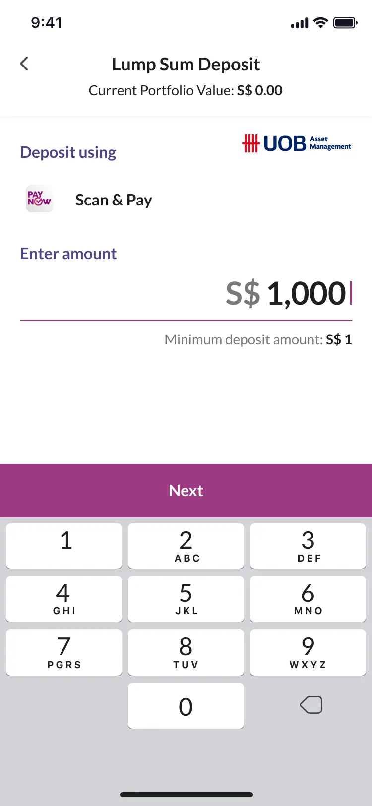
In the live app, this button saves the QR code to Photos so you can upload it in your bank app. Payments are simulated in this preview.
iPhone 11 Pro · 375 × 812 px
Dashboard
Launch
Launched in December 2021.
Singtel and UOBAM announced Robo-Invest’s launch on 21 December 2021.
If I were to take the product forward, I’d focus on:
- Testing risk-question wording and comprehension of portfolio information with Dash users new to investing, then checking whether they can understand their holdings and what they’ve invested in.
- Building a funnel to measure conversion rates from risk assessment to submitted identity details and then first deposit, using the drop-offs to guide the next iteration.